I decided to create this tutorial to show a cool looking effect for Motion. With lack of a better name, I called it “Slicing Effect,” where basically what’s happening is a drop zone is taken and made to look like lots of small “slices” are making it appear. It’s by no means a groundbreaking effect, but a fun one to know how to do. Here’s a video to show the final effect. This particular effect doesn’t look that great, but this Final Cut Effect is just a sample and has some incredible potential.
[embed_youtube src=”https://www.youtube.com/embed/OucpTBNepuQ” width=”700″ height=”394″ class=”youtube_styleme” id=”thisid”]
Song is “Friend” by “Blackmill.” Video Courtesy of Red Bull Content Pool: https://www.redbullcontentpool.com/content/international/products/web_clip_clean_bobby_brown
Step 1: Open A Motion Project and Create A New Drop Zone
Go to “Object” on the menu, then choose “New Drop Zone.”
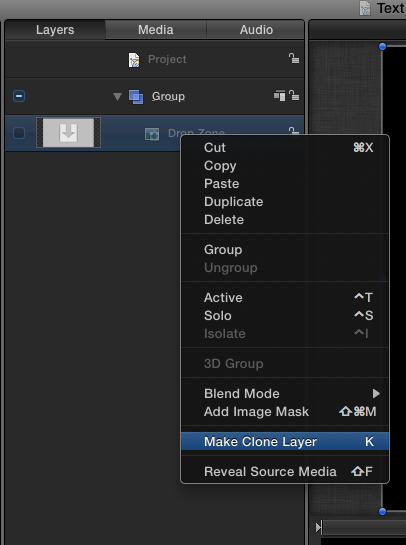
Step 2: Create A Clone of the Drop Zone
Right click on the Drop Zone, and choose “Make Clone layer.”
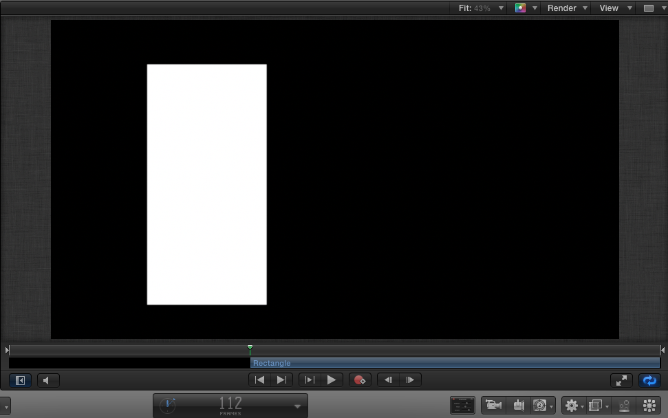
Step 3: Create A Rectangle
It doesn’t have to be perfect, but make it about that shape and size. (Use the Rectangle Tool for this) This is the basis for what is to put into the Replicator to create the effect.
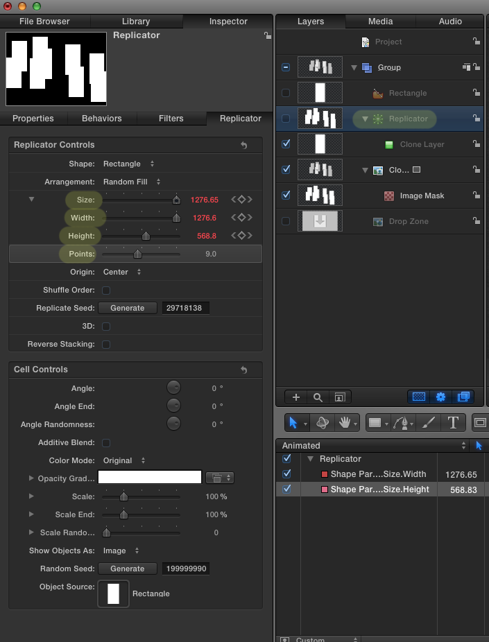
Step 4: Create A Replicator
Select the Rectangle we created, then click the “Create Replicator” button. (I’ve uploaded high-res images, so you can click and view the full image if you’re having trouble seeing). As for now, there’s 9 points in our Replicator, which has a size of 1276. Give your Replicator similar settings.
Step 5: Add Image Mask of Replicator To Drop Zone Clone
This is going to make our Replicator the source for the mask that we’re going to apply to our cloned Drop Zone.
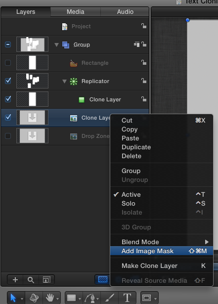
Right click on the Clone Layer we just created, and choose Add Image Mask.
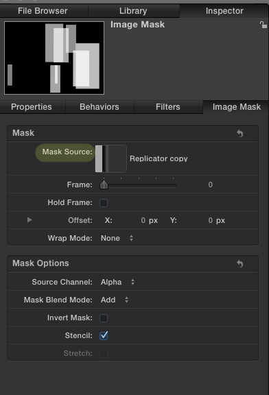
Then, change the Mask Source by dragging the Replicator we made into the Mask Source Box. This is making the Replicator the source of the mask for our Drop Zone. Above, you can see my Replicator in the Mask Source box.
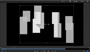
At this point, your Canvas should look something like this. If it doesn’t, go back to Step 4 to make sure that your Replicator is set up correctly. Keep in mind that based on the random seed, your rectangles should appear at slightly different locations. I will attach the actual project file at the end that you can download and look at if you’re having trouble getting it to work.
Step 6: Create The Fly In
With the Replicator selected, I’ve created these keyframes. This will make the effect start large, filling the screen at the beginning, then shrinking down slightly. What we’re adjusting is the width and height of the bounds, which is basically the boundaries, inside of which all of our rectangles exist. So, the larger the bounds, the more spread out the rectangles will be, and the smaller the more packed together they will be. The keyframes above make the bounds go from big to small, creating a “fly-in” effect.
Step 7: Add a Gaussian Blur to the White Rectangle
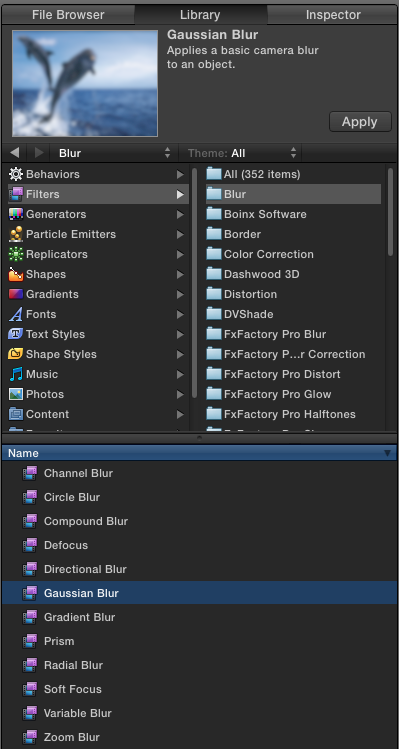
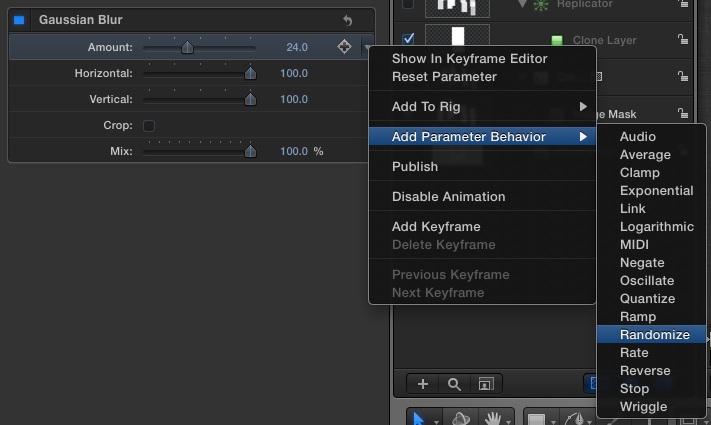
Under Library, Filters, then Blurs, find the Gaussian blur and apply it to the white rectangle (not the replicator). Change the amount to 24.
Step 8: Randomize the Gaussian Blur
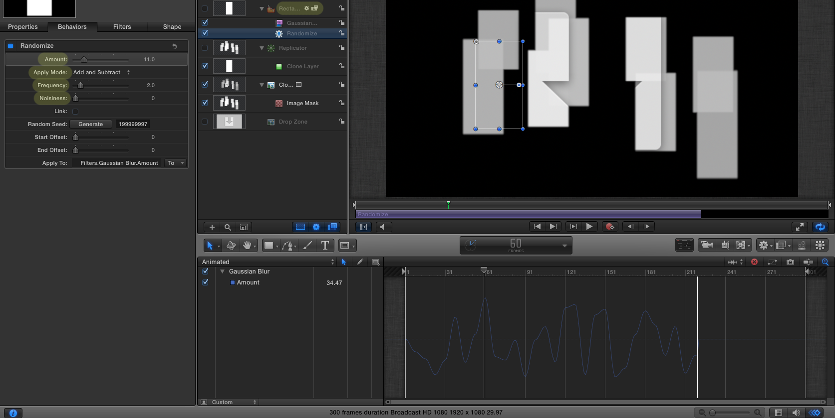
Add the “Randomize” parameter behavior to the amount of blur. Once you’ve applied the Randomize Blur, make it match the settings below. The animation window on the bottom right shows the variance in Blur. Make sure that you choose “Add and Subtract” under apply mode and change Amount to 11, Frequency to one or two, and turn Noisiness down. This will give the rectangles a natural looking blur.
Next, create a Keyframe on top of the “Randomness” to make it very blurry at the beginning when everything is flying in, then even it off. (Double click in the Animation Window to create a new keyframe) It should look like the image below.
Step 9: Create The Flyout
This is a continuation of Step 6. I have the original fly-in, the hold (the middle part) and the fly out (the last part where the width and height decrease). The orange and yellow are the width and height of the bounds of the Replicator, respectively. They represent the width and height of the area in which all of the rectangles reside.
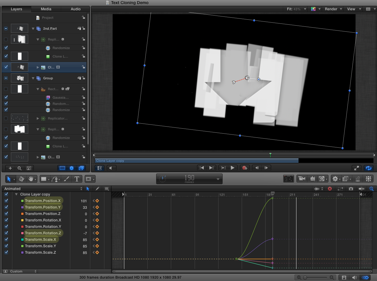
Next, we have to change the size of the whole Replicator layer, its location and rotation as it flies out. Select your Replicator in the Layers Panel, then make the following adjustments. The light blue line (Size) decreases towards the end as the whole effect flies out, because it gets smaller. The X Position of the Replicator (Light Green Line) increases, because when it flies out, it moves slightly to the right. It also rotates (Pink Line) a little bit as it flies out.
Next, we have to move the drop zone along with the Replicator, so they can still see the Drop Zone as it’s moving out. In other words, we want our Drop Zones and our Replicators moving out together.
With the cloned drop zone selected, we’re basically mimicking what we did in the last photo, but this time we’re editing the Drop Zone. This way, the drop zone will move with Replicator as it moves out. Just like the Replicator, the X Location is Increasing (moving to the right), the Size is decreasing and it’s rotatingslightly.
Step 10: Duplicate
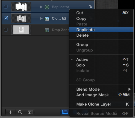
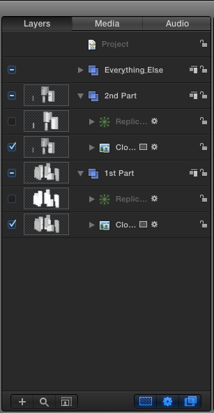
At this point, there aren’t quite enough rectangles to be able to see most of the Drop Zone. In order to be able to view more of the Drop Zone, I could simply increase the number of points in the first Replicator, which would add more rectangles, thus making the Drop Zone more visible. However, to make it look more organic, let’s duplicate the whole effect, then change some settings on the second one to make it slightly different. To do this, select both the cloned Drop Zone and the Replicator, and duplicate them. It helps to put them in a new folder to stay organized. (For example, in the folder”1st Part,” I could have the 1st Replicator and the 1st Drop zone. In the folder “2nd Part,” I could have the 2nd Replicator and the 2nd Drop Zone)
Here is what your Layers Panel could look like.
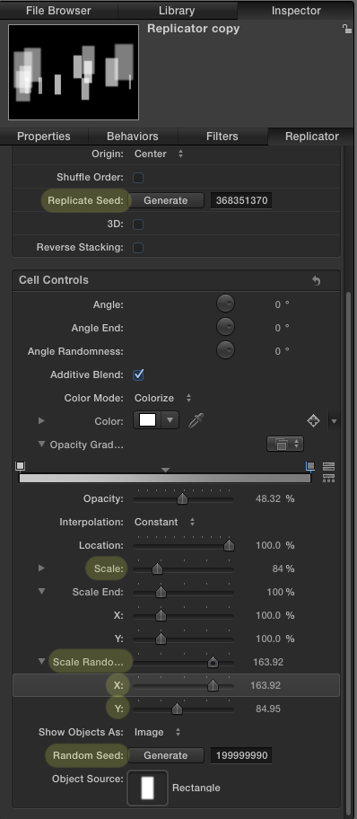
Below are the settings I chose for the duplicated Replicator. As you can see, I’ve changed a lot of the settings, such as the scale randomness, the scale and the number points. This will make it slightly different than the first one, which will help it fill in some of the gaps.
Step 11: Finishing Touches
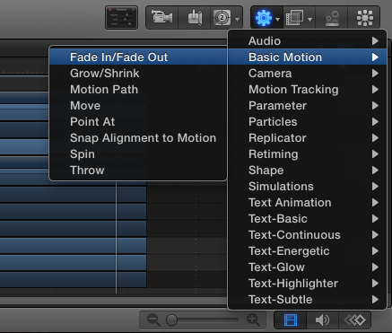
We’re almost done! Let’s add a fade in and fade out:
Adding a fade in and out makes it look a little smoother. Add a FadeIn/Fade Out to your Cloned Drop Zones.
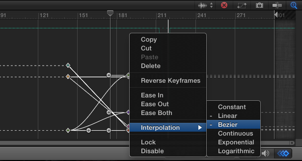
Let’s also change all of the keyframes we can to Bezier. It makes all of your animations less abrupt, and smoother looking. You can do it to whatever keyframes you like; just select the ones you want, right click, and under Interpolation, choose Bezier.
That’s it! If there’s something you missed or didn’t understand, feel free to ask us in the comments section below. Below is also a download link for the project file for you to take a look at. Feel free to use it as a Final Cut Effect or for whatever you want. I tried to simplify as much as possible for the tutorial, so there’s a few extra elements to look at, should you decide to download. Enjoy!
Download Motion Project

