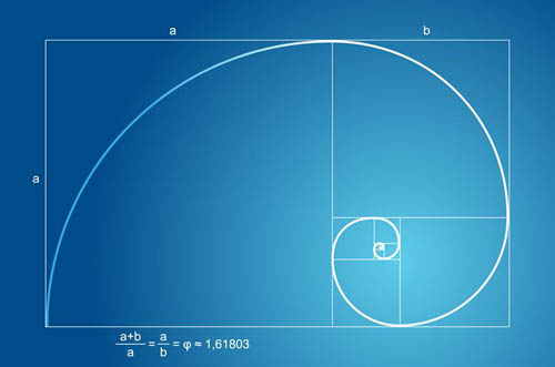
In design, there’s something know as the “Golden Number,” the “divine number,” and a myriad of other mystical names. I’m going to ignore the math behind it and state plainly that it’s 1.618033987, it is based on some simple algebra/trigonometry, about which I have no problem. Very nice. Supposedly it is a mathematical concept that nature obeys. As the visual learner I am, let’s take a look at the Golden Number in design. Here it is applied to the ratio of a rectangle:

(Image Source: creativeautomaton.com)
Now let’s look as some of its implications in nature/human history.

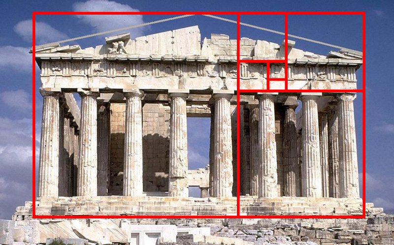
(Image Source: in2visualdesign)

(Image Source: http://img.gawkerassets.com/img/18f8x3mkekfexjpg/original.jpg)

(Image Source: http://britton.disted.camosun.bc.ca/goldslide/gold08.jpg)

(Image Source: https://farm1.static.flickr.com/58/182577397_aa27d7830d.jpg)
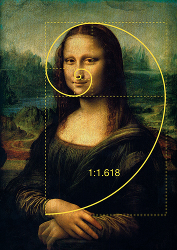
The Mona Lisa painting reminds me of a Dan Brown novel, but the takeaway is that certain designers/videographers believe that through our built in appreciation of the Divine Number, paintings like Mona Lisa have greater affected us. It could easily be assumed that this “Golden Number” is rampant throughout nature, and thus must be the key to making good design. However any logical person must question the existence and presence of a Golden Number. There are two fundamental flaws:
Is this number really as prevalent throughout society and nature as people say it is, or are the connections forced?
Even if this number exists in nature, is it really better for design? Does nature really affect our design preferences?
“Forced Associations”
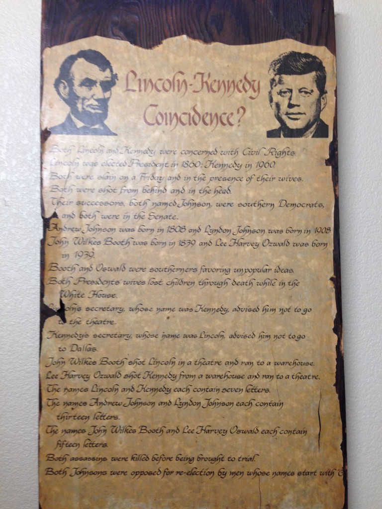
To answer the first question, let’s look at a “Lincoln-Kennedy Coincidence” plaque I have. Let me show you:

John Wilkes Booth shot Lincoln in a theatre and ran to a warehouse. Lee Harvey Oswald shot Kennedy from a warehouse and ran to a theatre. Interesting! However, if you read through many of these connections, such comparisons could be made between any two people. While at first it seems intriguing, this plaque is in fact the compilation of specific, random facts that support an argument. It’s quite convincing, but what if you look at all the things they didn’t have in common? The amount of things they don’t share is overwhelming compared to this small list of carefully assembled things they do. Let’s take a look at one, for example. “The names Lincoln and Kennedy each contain seven letters.” Guess what? So do lots of names!
My Own Magical Number
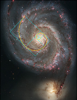
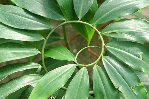
The reason I bring up this example, is to show that while this pretty looking spiral certainly matches a galaxy and the plant above, it’s all too easy to find 10-15 applications of it in nature and assume that it’s omnipresent throughout nature. Guess how many plants/animals/phenomenons aren’t able to be mapped with this ratio? Probably at least 99% of them. Also, many of the applications are “iffy.” The ancient temple above? Does it really fit that good? To prove my point, let me come up with my own number: 1.522.
In order to make my number have a more logical appeal, I will show you the math behind it:

Our number: 1.522. The significance of the numbers in the equation you might ask? Easy. On the integral, there’s 12 months in a year. 365 days in a year and 24 months in two years! We have five fingers per hand, there’s 28 days in February, (sometimes) and one fifth of Americans don’t believe in a god.
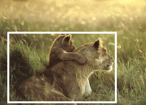
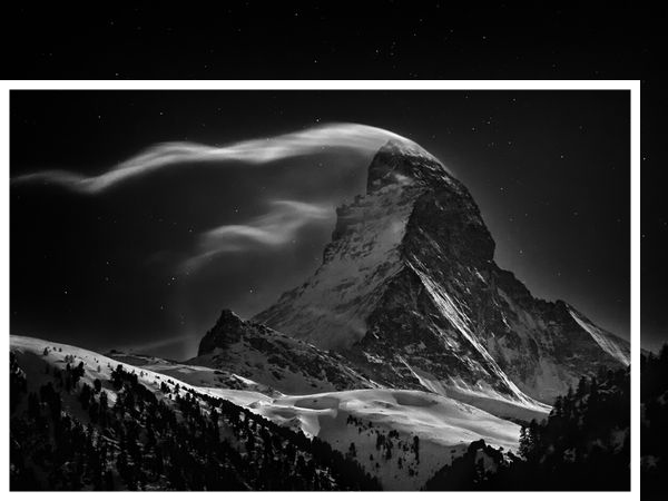
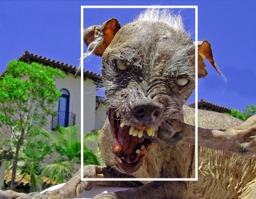
I expect you will doubt my carefully calculated mathematics, but to that I say: look at these pretty pictures! (Credits go to http://www.nationalgeographic.com/) As you can see, my ratio of 1 : 1.522 matches these nature photos perfectly. Coincidence? I think not!


Not sure how that last photo got in there, but as it goes, the evidence is unsurmountable. Not only does my ratio occur in nature, but it exists in photos that have won National Geographic‘s photo of the year. Therefore, my number 1.522 is the epitome of good design! I’m not so much criticizing the number 1.6 as I am the methodologies used to obtain and defend it. Hands down, an aspect ration of 1.6 and it’s use in design is stellar. But Mona Lisa and Ancient pyramids to defend it? Well…
As witnessed above, (I didn’t even do that great of a job) it’s fairly easy to apply a certain number to “nature.” All you have to do is find certain situations that do fit your criteria, maybe cut a few corners and you have a perfect match. In my opinion, my square matches the fish just as well as the spiral matches the Mona Lisa, although perhaps not quite as elegant.
Now that we’ve looked at the “Golden Number” in nature, let’s take it to design.
Reason In Design
I’m not making the argument that the Golden Ratio doesn’t look good in design, because it most certainly does. It is appealing to the eyes. But what about my number? 1.5 and 1.6 are not all that far off. What about 1.777? 1.413? Could you really tell the difference? People who praise the Golden Number will tell you that there is insurmountable evidence that humans are, so to say, “tuned in” to the Golden Ratio, that we are attracted to it and it resonates well within us. Despite claiming that sound scientific studies prove that the Golden Number is more attractive, (of which I have not been able to find any, please leave a comment if you can find some) I highly doubt that someone while watching a movie would undergo a different experience if it were presented on a 1.6 ratio screen vs a 1.5 one. Hell, even in the old 4:3 ratio, (corresponds to 1.333) if the cinematography, composition, and scene were constructed correctly, the final product can be stunning. It is my opinion that things like lighting, dynamic range, the use of depth of field and the angle of capture to name a few are ever more important than adhering to the Golden Rule.
The rule of thirds, which is “derived” from this Golden Number is a commonly accepted guideline in photography especially. However, if you’ve ever done photography, you know that a lot goes into getting a good shot, and often times this guideline is broken. As opposed to something that can be explained by a number or a principle, I believe photography, cinematography, and design is an art— something where the creative visualization of an idea is key. The Golden rule is a great guideline for good design, but the part I most enjoy about design is the ability to leave the realm of numbers and strive to express new emotions and ideas in a personal way, something that can never be dictated by a “divine” mathematical term.
If you would like to learn more about the Golden Ratio, please try THIS SITE.


